

Date: May 2023
Role: Lead UX Designer
Tools: Figma, Slack, Sketch,
Miro, Excel
Duration: 18 weeks
Impact Snapshot
88%
Increase in successful checkouts
92%
Load time satisfaction reached
90%
Satisfaction on accessibility & User flow
The Problem

Cinema's magic endures, with U.S. theaters hosting over 1.3 billion visitors in 2020, but outdated apps are dimming the excitement. Clunky interfaces, poor accessibility, and frustrations drive users away, turning simple bookings into tedious tasks.
My goal: Transform Iris into a seamless, inclusive app that reignites anticipation, addressing barriers like time constraints, language gaps, vision issues, and lack of incentives.
Research & Discovery

To uncover why users abandon apps, I analyzed hundreds of reviews from major players: AMC, Studio Movie Grill, and Regal Cinema (via Google Play and Apple App Stores). Key barriers emerged:
User Persona

User Journey Map
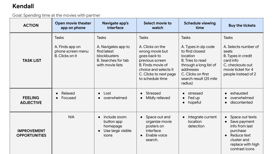
Design Process
Grounded in research, I mapped the user journey holistically before detailing interactions.
Storyboards

Started with big-picture sketches capturing emotional context (e.g., post-work fatigue triggering app use).

Zoomed into close-up storyboards for app flows: Search, seat selection, checkout, focusing on speed and trust.
Wireframes
Translated insights into paper sketches for rapid ideation, prioritizing user-first principles. Digitized in Sketch for structured layouts, ensuring hierarchy and minimalism.


Lo-fi Prototype
Built clickable grayscale prototypes in Figma to test core interactions early, identifying friction without visual distractions.
Testing & Iteration
Ran unmoderated usability testing with 5 diverse participants (ages 28-42, including 2 with vision impairments) via Figma prototypes.


Affinity Map
With feedback from the first round in hand, I refined the design and developed a high-fidelity prototype, now with polished visuals, colors, and interactions.


Accessibility features
Iconography
Large icons and easy to read fonts; to allow for lower or no eye strains

Typing
Tap to speak Keyboard; For when users are utilizing the search function

Language
Considering some of our users may be non English speakers, a translator feature was added.

Taking into consideration the feedback from the first usability test, I conducted a second test with the high-fidelity iterations. Data showed great improvement in the participants’ interaction, as shown by the statistics below:


Result and Impact
The real-world performance of Iris Cinema outshone industry benchmarks. Where most movie apps struggled with clunky flows and sluggish performance, Iris delivered results:

88%
checkout success, well above the 50% industry average, driven by smoother flows and fewer friction points.
92%
load time satisfaction, showing users valued the app’s near-instant speed and reliability.
90%
navigation ease, proving that users found the app’s layout intuitive, clear, and seamless to shop with.
User testimonies


Learnings & Next Steps

Takeaways: Empathy-driven storyboarding revealed hidden emotions; Early testing cut iterations by 30%, now a core part of my process. Inclusivity isn't optional; it's essential for engagement.

Growth Plan: Conduct moderated tests with 20+ users; Integrate AR previews; Collaborate on MVP development; Expand to streaming integrations.