Confidentiality Notice: This case study has been adapted to protect confidential information. Company names, branding, product details, and selected visuals have been anonymized or recreated, while preserving the underlying UX challenges, design methodology, and measurable outcomes.
Date: 2026
42%
Role: Support UX/ Product Designer
Impact Snapshot
Drop in status related customer service calls
3X
Increase in self service status checks
Tools: Figma, Jira, Maze, Design system library
Duration: 4 months
91%
SUS score in usability testing
The Problem

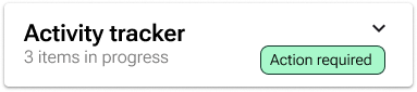
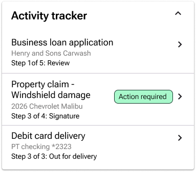
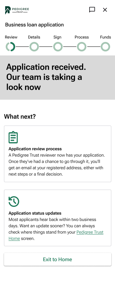
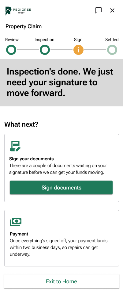
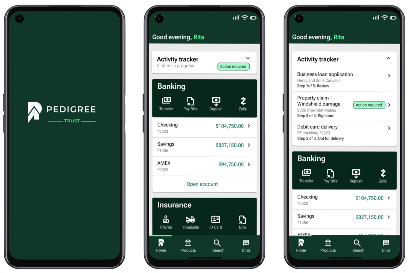
Users with an active loan application, an insurance claim, or a pending card delivery had no single place to check where things stood, so they called support to ask a question the system already had the answer to. I set out to eliminate that gap entirely.



Scattered status visibility: Progress on loans, claims, and deliveries lived in disconnected corners of the app, with no shared home for "what's happening right now."
No clear next step: Members could see that something was in progress, but rarely what action, if any, was expected of them.
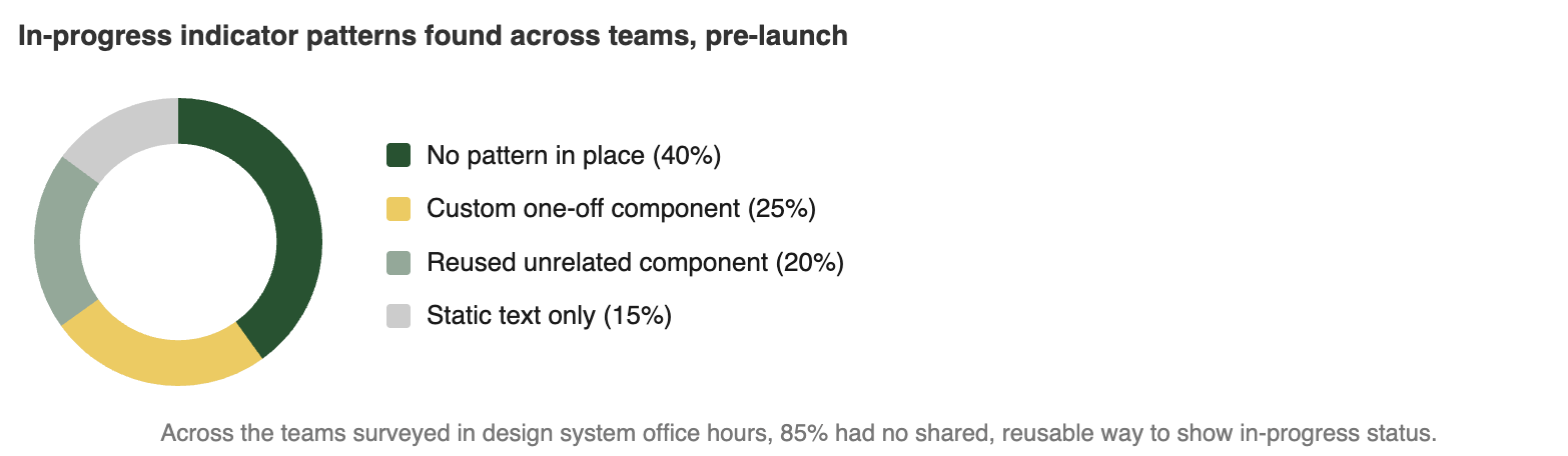
No reusable pattern: The design system had no established component for surfacing mixed, multi step processes on the home screen, so every team was solving this differently.
The Goal: Deliver a single, collapsible home screen component that surfaces real time status across banking, insurance, and lending, and makes it unmistakable what needs the member's attention next.
Research & Discovery

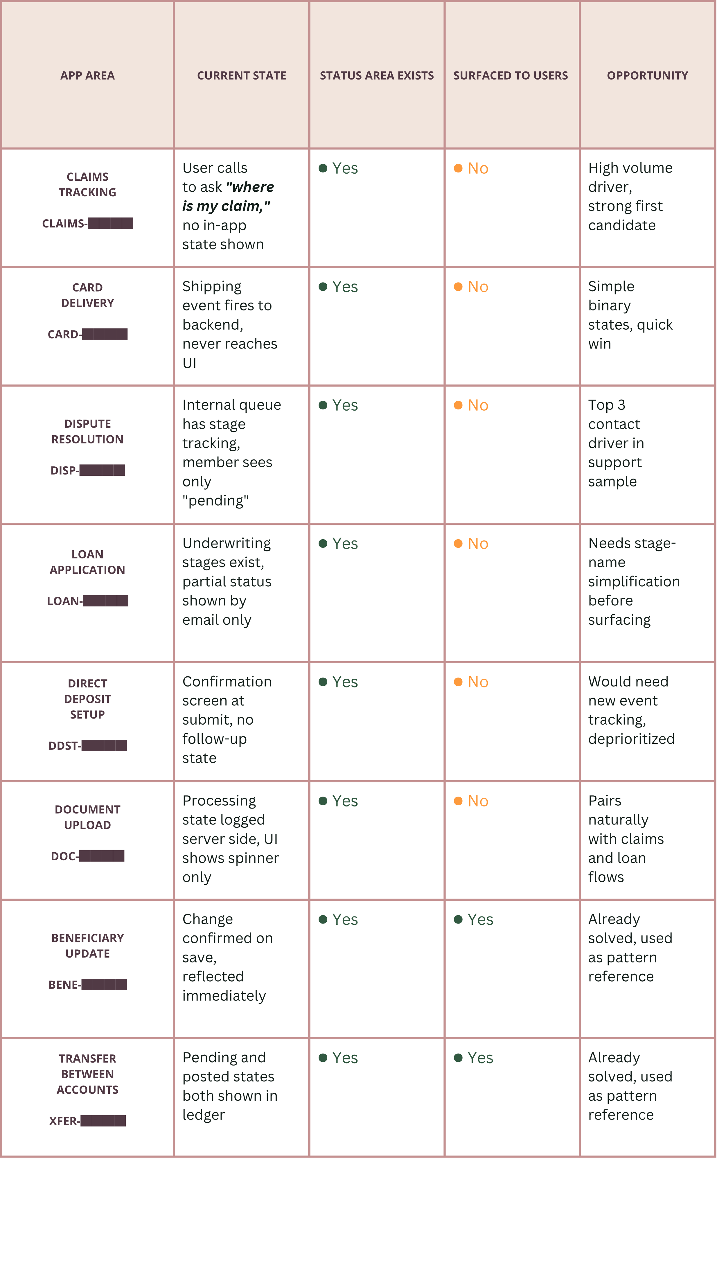
Where status already exists, and where it never made it to the screen
A cross-app audit of every flow with a status or progress state, checked against whether
the underlying data exists and whether a user can actually see it today. Sample data
below is redacted for confidentiality.
8
Flows Audited
8
Data already exists
6
Not surfaced to users
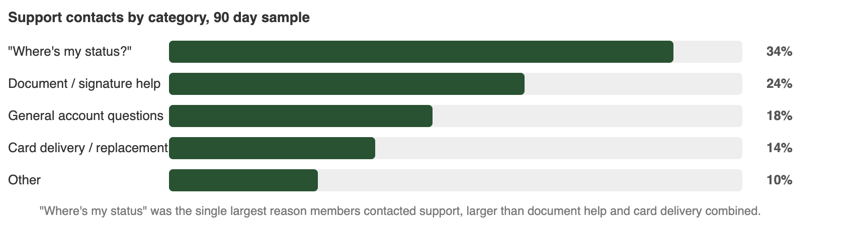
90d
Support window
data
FIELD SAMPLE · REDACTED
What I found
Design and Ideation